Glyph mosaic
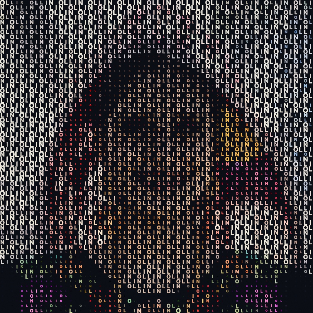
drawGlyphMosaic rebuilds an image as a grid of text glyphs. Each cell measures the brightness of the image underneath it, then shows the character whose ink coverage matches. This is the general form of the classic text-mode rendering. The character set is any string you type, and you do not order the ramp by hand. Instead, Ollin measures the ink coverage of every glyph in the active font. That is why quadrant blocks, checkered squares, braille dots, and plain letters all sort correctly. For the same reason, a character the font does not cover drops out.
By default, bright cells get dense glyphs. That reads as light marks on a dark canvas, which is the terminal look. Pass inverted: true for the paper look, where dark cells carry the ink instead. The result is deterministic for a given image, column count, character set, and font. That makes a mosaic safe in a snapshot test and in a recipe.
The glyph mosaic is the picture a line printer made in the 1960s, and the character ramp is the text-mode tradition that followed. Paul Bourke cataloged the standard ramps in 1997, and Ollin measures the ramp instead of ordering it by hand. See ATTRIBUTION.md.

The right panel is drawHalftone, which answers the same question with one dot per cell, grown to cover the cell's share of ink. A mosaic has as many tones as it has characters, so a ramp steps. A halftone's radius is continuous, so its ramp is smooth. Their default polarity also runs the other way. The mosaic grows its mark with brightness and the halftone grows its dot with darkness, so one of them takes inverted: true when both should read alike.
Contents
drawGlyphMosaic
drawGlyphMosaic(_ image: Image,
                columns: Int = 72,
                characters: String = GlyphSet.technical,
                in bounds: Rectangle? = nil,
                inverted: Bool = false,
                colored: Bool = false,
                glyphScale: Double = 0.85)
Draw image as a glyph mosaic, sampled columns cells across. The image keeps its aspect ratio inside bounds, which is the whole canvas by default. Glyphs draw in the current fill color. Pass colored: true instead, and each glyph takes the color of the image underneath it.
textFont(BitmapFont.builtIn)     // the bundled bitmap font covers every mark
fill(.white)
drawGlyphMosaic(picture, columns: 72)
glyphScale is the fraction of its cell that each glyph fills. The default of 0.85 leaves a gutter between cells, so even solid blocks read as separate marks. A value of 1 tiles the full-cell block and shade characters edge to edge, so the mosaic has no gaps.
glyphMosaic (the data form)
glyphMosaic(of image: Image,
            columns: Int = 72,
            characters: String = GlyphSet.technical,
            in bounds: Rectangle? = nil,
            inverted: Bool = false) -> [GlyphMosaicCell]
glyphMosaic returns the same mapping as data instead of drawing it. Each cell that received a glyph becomes one GlyphMosaicCell. The cell carries its column and row, its center and size, and the chosen character. It also carries the sampled brightness and the average color of the image underneath it. Use the cells to draw the mosaic your own way. You can jitter the positions, animate each cell, or color by a rule of your own. To send the mosaic to a plotter or to SVG, turn each glyph into vector geometry with textToShapes.
for cell in glyphMosaic(of: picture, columns: 60) {
    fill(Color(hue: cell.brightness, saturation: 0.6, brightness: 1))
    drawText(String(cell.character), at: cell.center)
}
Character sets
Any string is a character set, and the measured ramp orders its glyphs by ink coverage. Three ready-made sets ship as GlyphSet statics:
GlyphSet.technicalis the default. It holds geometric and technical marks. The ramp runs from dots through crosses, fine grids, checkered squares, quadrant blocks, and braille textures, then ends in the solid blocks. It looks best in the bundled bitmap font, because that font covers every mark in the set.GlyphSet.classicis the traditional letterform ramp.:-=+*#%@. It gives the typewriter look, and it works in any outline font.GlyphSet.blocksis block elements only. It gives a chunky mosaic with no recognizable characters. Pair it withglyphScale: 1to tile the blocks without gaps.
A custom set is easy because the measured ramp orders it for you. A set like "·+x▚█" works, and so does a set whose densest glyph is not a solid block. If you leave out the blocks and shades, the brightest cells stay separate marks with gutters between them, which is often the better look.
Practical notes
- It re-reads the image on every call, so a mosaic over a live painting or a video frame animates with no extra work. The ramp itself is measured once per font and character set, then cached.
- The empty floor is deliberate. A cell whose ink target is below half the coverage of the sparsest glyph draws nothing. That way, shadows read as true empty areas rather than a field of dots.
- Brightness is perceptual. Each cell averages its pixels, then maps the average through the same transfer curve the eye expects. A midtone therefore lands midway up the ramp. A transparent pixel carries no ink, in the default mapping and in the inverted one.
- A texture-backed image has no CPU pixels. A video frame or a camera image is read through its
snapshot()first. Every CPU image pass works that way. - Bitmap fonts count lit pixels exactly. Outline fonts measure the filled glyph area, and stroke fonts for plotters measure pen travel. Each kind of font is consistent within itself, and the ramp normalizes to its densest glyph.
Related: Text (fonts, drawText, text as geometry), Images (the pixel access the mosaic uses to sample the image), Stippling (tone from free dots instead of a glyph grid), Pixel sorting (another image-as-input transform).