Text
Ollin draws text in three kinds of font. All three use the same drawText / textFont / textSize / textAlign calls:
- An outline font is a real TrueType/OpenType (
.ttf/.otf) face. Each glyph is stored as vector contours and drawn as aShape. One load draws crisp at any size. The type takesfilland anystrokeyou set, and the glyph geometry is yours to work with. The default font is an outline font, so text works with no setup. - A bitmap font stores each glyph as a small grid of pixels. Each lit pixel is stamped as one square on the same instanced-SDF path the shapes use, so there is no rasterizer and no separate pipeline.
- A stroke font is a single-line (plotter) face. Its glyphs are open pen paths with no fill, drawn with the current
stroke. This is the kind of letterform a pen plotter draws, and Hershey Sans comes bundled.
All three follow the transform stack, composite in draw order with everything else, and stay crisp at any size.

The default font is OutlineFont.systemMedium, the system UI face (San Francisco on macOS) at medium weight. That weight is a little sturdier than the regular one, so text holds up over busy canvases, and drawText works with no setup. For a pixel look, use the bundled BitmapFont.builtIn, which is Cozette. Cozette is a 13px pixel font that covers a wide range. It has Latin (including the Spanish accents á é í ó ú, ñ, ü, ¿, ¡), Cyrillic, Greek, and Japanese kana. Call these bare inside draw(), and they forward to the Drawer.
Contents
- drawText - draw a string
- drawStatus & drawCaption - standard notices and labels, one call each
- textFont, textSize, textAlign - text state
- textWidth - measure a string
- Outline fonts -
OutlineFont, loading a.ttf/.otffrom anywhere - Rendering at volume -
textMode(.atlas)for paragraphs and large glyph counts - Variable fonts - animate weight, width, and other axes
- Stroke fonts -
StrokeFont, single-line / plotter type - Per-glyph drawText - give each letter its own transform and color
- Text on a path - lay glyphs along a curve
- Box layout - wrap a paragraph into a rectangle
- textToShapes - text as first-class geometry
- Type as a solid -
drawText3D, a word extruded into a 3D mesh - Metrics -
textAscent/textDescent/textLeading/textBounds - Every script - Arabic, Devanagari, Thai, Japanese, emoji, and what changes
- textDirection - which way a line runs
- Writing in columns - Japanese and Chinese set top to bottom
- Columns that fill the other way - traditional Mongolian, whose letters join
- textJustify - both edges of the box flush
- textHangingPunctuation - let a stop sit past the end of a line
- textMissingCharacters - what the font cannot draw
- BitmapFont - the bitmap font value type, and authoring your own
drawText
drawText(_ string: String, _ x: Double, _ y: Double)
drawText(_ string: String, at position: Vector2)
drawText(_ string: String, at position: Vector2,
         size: Double? = nil, color: Color? = nil,
         align horizontal: HorizontalTextAlign? = nil, _ vertical: VerticalTextAlign? = nil)
Draw string at a point, in the current fill color, using the active textFont / textSize / textAlign. A \n starts a new line. Glyphs are geometry, vector shapes for an outline font and SDF squares for a bitmap one. So text rotates and scales with the transform stack like everything else. noFill() draws nothing, and a character the font does not have advances the pen but draws nothing.
background(.black)
fill(.white)
textSize(120)
textAlign(.center, .middle)
drawText("ollin", width / 2, height / 2)
The styled form draws a label in one call. Any of size, color, and align that you give apply to this text alone, so the standing state comes back untouched. It replaces the four calls a label usually needs first:
drawText("Hello", at: center, size: 32, color: .white, align: .center, .middle)align takes the same pair as textAlign(_:_:), and the vertical part defaults to .baseline. color paints the glyphs in exactly that color for every font kind. It sets the fill, or the stroke for a stroke font, and it suppresses the outline that a standing stroke would add. The scalar (x, y) and box forms take the same three arguments.
drawStatus & drawCaption
drawStatus(_ message: String, style: StatusStyle = .info, in container: Rectangle? = nil)
drawCaption(_ text: String, edge: CaptionEdge = .bottom)
Each of these draws a standard piece of text in a single call, so a state the sketch should report never stays silently blank:
drawStatuscenters a standard notice incontainer, which is the whole canvas by default, and wraps the notice if it is long. An.infonotice draws in quiet gray, as in "Waiting for camera…", whichdrawFramedoes for you. A.warningnotice draws in salmon, for a vision model that can't run here or a missing install.drawCaptiondraws a small white label along the bottom edge, or along the top withedge: .top. Use it to say what the sketch is, what it is showing, and what to do with it. It draws over the finished frame, the way awithOverlayblock does, so it stays sharp and white over a depth of field, a motion blur, a bloom, or a lens flare, and never joins an accumulating canvas.
if let reason = tracker.unavailableReason {
    return drawStatus(reason, style: .warning)
}
drawCaption("FaceTracking · \(faces.count) faces")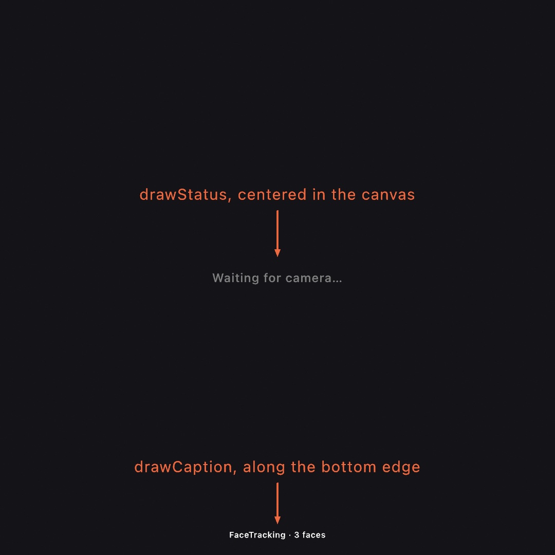
Both draw in their own standard typeface, size, and alignment. That state is scoped like a withState { }, so the sketch's own fill, font, and alignment are untouched afterward.
textFont
textFont(_ font: BitmapFont)
textFont(_ font: OutlineFont)
textFont(_ font: StrokeFont)
Set the active font. It can be a bitmap face on a pixel grid, an outline face from a .ttf or .otf file, or a stroke face drawn as single lines. The default is OutlineFont.systemMedium, and textFont(OutlineFont.systemMedium) switches back to it. Use textFont(BitmapFont.builtIn) for the bundled Cozette pixel font. Like the other drawing state, the active font is part of the push/pop stack, so withState { textFont(custom); … } restores the previous font automatically on exit. See BitmapFont to load or build a bitmap font, Outline fonts for a .ttf/.otf, and Stroke fonts for single-line type.
textSize
textSize(_ size: Double)Set the rendered text height in points, the height one line of glyphs occupies on screen. A BitmapFont is authored at a native pixel height. textSize scales each of its pixels to a module of size / font.pixelHeight points, so textSize(140) makes one line 140 points tall whatever the font's grid. The default is 24.
textAlign
textAlign(_ horizontal: HorizontalTextAlign, _ vertical: VerticalTextAlign = .baseline)Set how text is anchored to the drawText position.
- Horizontal (
HorizontalTextAlign):.left(default) starts the text at the x,.centercenters it,.rightends it at the x. - Vertical (
VerticalTextAlign):.baseline(default, like p5) sits the first line's baseline on the y..topand.bottomalign the block's top and bottom edge, and.middlecenters the whole block..centeris accepted as an alias, sotextAlign(.center, .center)compiles.

textAlign(.center, .top)
drawText("two\nlines", width / 2, 100)   // centered, growing downward from y = 100
textWidth
textWidth(_ string: String) -> DoubleThe on-screen width of string's widest line, in points, at the current textFont / textSize. Use it to lay text out yourself, for centering by hand, wrapping, and marquees.
let size = 42.0; textSize(size)
let w = textWidth(label)
drawRect(center: Vector2(x, y), width: w + 24, height: size + 16)   // a padded backing
Outline fonts
textFont(_ font: OutlineFont)An OutlineFont is a real TrueType/OpenType (.ttf/.otf) face. Unlike a bitmap font, it stores each glyph as vector contours. So one load draws crisp at any textSize, and you never reload for a new size. Set it with the same textFont, and drawText, textSize, textAlign, and textWidth all work exactly as before.
An outline glyph is rendered as a Shape, the same vector fill the triangulator draws. So outline text takes the current fill and composites in draw order with everything else. Once you have set a stroke, text takes that too. That gives you filled text, outlined text, and stroke-only text:
let display = OutlineFont(name: "Avenir Next") ?? .system
textFont(display)
textSize(160)
textAlign(.center, .middle)

fill(.white); noStroke()
drawText("filled", width / 2, 240)

noFill(); stroke(.white); strokeWeight(2)
drawText("outline", width / 2, 480)
[!NOTE] Text uses a stroke you have set. A leftover
stroke(...)from earlier drawing will outline your glyphs, so callnoStroke()when that is not the look you want. The one stroke that never applies to text is the initial default, the 1px black every fresh sketch starts with. A band around every contour would bold text on a light ground and eat thin light glyphs on a dark one. So glyphs take only a stroke the sketch asked for.
Loading a font, from anywhere:
OutlineFont(name: "Helvetica Neue")             // an installed family / PostScript name
(try? OutlineFont(path: "/path/to/Font.otf"))          // a file on disk
(try? OutlineFont(url: fileURL))                        // a file:// URL
(try? OutlineFont(data: bytes))                          // raw .ttf/.otf data
(try? OutlineFont(resource: "Font.ttf", in: .module))   // a font bundled beside your sketch

OutlineFont.system        // the system UI font (San Francisco on macOS)
OutlineFont.systemMedium  // medium weight, the default text font
OutlineFont.systemBold
OutlineFont.systemMono
init(name:) returns nil if no installed font matches, so a typo fails loudly instead of quietly substituting another face. Pair it with a fallback, as in OutlineFont(name: "Futura") ?? .system. A remote https:// URL needs an asynchronous download, and that cannot run on the draw thread. Fetch it in setup(), or ahead of time, then pass the bytes to init(data:).
Ollin ships no .ttf/.otf of its own, so you bring the font yourself, installed, bundled, or fetched. Layout goes through Core Text, so kerning, ligatures, and fallback for missing glyphs come with it.
Rendering at volume
By default each outline glyph is filled as a vector shape. That is the highest quality, and it takes fill and stroke. It is the right choice for headlines and body text. But a paragraph of thousands of glyphs is re-tessellated every frame, and that gets expensive. textMode(.atlas) switches outline text to a signed-distance-field atlas instead. Each glyph is rasterized once into a shared texture and drawn as a single quad that samples it. The per-glyph cost then drops to a handful of vertex writes. The text stays crisp under magnification, and one raster serves every textSize.
textFont(OutlineFont.systemMono)
textSize(18)
textMode(.atlas)              // the default is .outline

for (i, line) in paragraph.enumerated() {
    drawText(line, margin, top + Double(i) * lineHeight)
}
textMode is drawing state, like textSize and textAlign. It persists until you change it, and it scopes with withState { }. So you can keep big headlines on the crisp .outline path and switch to .atlas for the block of small text:
textMode(.outline); textSize(120); drawText("Title", x, y)
textMode(.atlas);   textSize(16);  drawText(bodyText, x, y2)
Setting text one character at a time costs no more than one string. Calls in a row with nothing else drawn between them share one draw call, whatever their color and size, so a grid of characters placed cell by cell is as cheap as the same characters in lines.
There are two things to know. The atlas path is fill-only and ignores stroke, because the volume case is filled text, so use .outline when you want stroked glyphs. The single-channel field also rounds very sharp corners at extreme magnification, which you cannot see at the body and display sizes this path is for. textMode does nothing for bitmap and stroke fonts, which have no atlas. See the TextVolume example.
Variable fonts
A variable font holds a family's continuous design axes (weight, width, optical size, slant) in one file. OutlineFont exposes those axes. variation(_:) returns a copy with axes set, and variationAxes lists what a font offers and the range of each axis.
let skia = OutlineFont(name: "Skia")!
print(skia.variationAxes)   // [(tag: "wght", name: "Weight", min: 0.48, max: 3.2, default: 1), …]

textFont(skia.variation(["wght": 2.6, "wdth": 1.2]))   // heavy, a touch wide
Keys are the 4-character axis tags ("wght", "wdth", "opsz", "slnt"). Values are in the font's own axis units, and the ranges differ from font to font, so read them from variationAxes. The one-axis calls weight, width, opticalSize, and slant each set a single axis. Combine several of them in one variation(_:) call, and they do not reset each other.
A varied font is another OutlineFont, so you can animate the axes to move a word from thin to heavy:
textFont(skia.variation(["wght": map(sin(time), -1, 1, 0.5, 3.1)]))
drawText("ollin", width / 2, height / 2)
A non-variable font ignores variation and returns an empty variationAxes.
Stroke fonts
textFont(_ font: StrokeFont)A StrokeFont is a single-line font, so each glyph is a set of open pen paths with no interior. A bitmap font stamps pixels and an outline font fills contours. A stroke font is stroked instead. It draws with the current stroke (weight, join, cap) and ignores fill, which is the mirror image of outline text. It is the letterform a pen plotter wants, and it suits thin, even line weights.
textFont(StrokeFont.builtIn)        // Hershey Sans, bundled
textSize(160)
textAlign(.center, .middle)
stroke(.white); strokeWeight(2)
strokeCap(.round); strokeJoin(.round)   // a softer, drawn line
drawText("ollin", width / 2, height / 2)
The bundled default is Hershey Sans, from the public-domain Hershey vector fonts. The glyphs are open paths, so textToShapes hands them back as open contours. Stroke or warp those rather than filling them. They also go through the same per-glyph and text-on-a-path calls as the other font kinds.
Loading more single-line fonts: Ollin reads the Hershey .jhf format. You can drop in any of the many Hershey faces (serif, script, gothic, Cyrillic, Greek):
let serif = (try? StrokeFont(resource: "rowmans.jhf", in: .module)) ?? .builtIn
textFont(serif)
A StrokeFont measures itself in the font's own units, which unitsPerEm divides to turn into a fraction of the em: ascentUnits, descentUnits, lineGapUnits, and spaceAdvanceUnits are the raw numbers, and ascent, descent, and leading the same three as fractions, so multiplying by the rendered textSize gives points. advanceUnits(for:) is one character's pen advance and lineAdvanceUnits(of:) a whole line's, both in font units. Each glyph is a StrokeGlyph, whose polylines are the pen paths the stroke follows.
StrokeFont(resource:in:) loads a font bundled beside your sketch, and you pass .module for a swift run sketch's resources. StrokeFont(jhfContentsOf:) takes any file URL, and StrokeFont(jhf:) parses .jhf text you already have. The Hershey faces live in many public-domain mirrors, for example kamalmostafa/hershey-fonts. For the wider world of single-line type, Golan Levin's single-line-font resources is a good map, and each font there has its own license to check. Ollin ships only the parser and the one Hershey default.
Per-glyph drawText
drawText(_ string: String, _ x: Double, _ y: Double, perGlyph: (TextGlyph) -> Void)
drawText(_ string: String, at position: Vector2, perGlyph: (TextGlyph) -> Void)
This trailing-closure form of drawText hands you each glyph as a TextGlyph instead of drawing the string for you. Give each letter its own transform or color, then stamp it with g.draw(). Use it for per-letter waves, rainbows, and springs. It draws a single line.
textAlign(.center, .middle)
drawText("ollin", at: center) { g in
    fill(palette.color(at: g.progress))          // a hue per letter
    withState {
        translate(0, sin(time * 3 - Double(g.index) * 0.7) * 60)   // bob on a wave
        g.draw()
    }
}
The closure runs once per piece. A piece is one character in Latin, a whole syllable in Devanagari, or a ligature. See Every script.
Each piece's shapes are the outline the plain drawText fills: cleaned of the overlapping sub-contours some system faces build a glyph from, and simplified to a third of a pixel. A glyph stamped unchanged, or set along a path, is therefore the plain run's glyph to the pixel.
A TextGlyph carries:
textis the source characters of the piece, andcharacteris the first of them.indexandcountare its place in the run, andprogressis the normalized position0...1across it.- The order runs left to right on the canvas, even for a right-to-left script that reads the other way.
positionis the pen origin in canvas space, at the left edge and on the baseline.centeris the natural pivot for rotating the glyph in place, andboundsis its advance box.shapesis the glyph geometry in canvas space, for text-as-geometry per letter.isPicturemarks an emoji stored as a bitmap in the font. Its shapes are empty, butdraw()still stamps it.draw()stamps the glyph with the currentfill/stroke, through your transform.
To rotate a glyph about its own center, pivot on center:
withState {
    translate(g.center); rotate(angle); translate(g.center * -1)
    g.draw()
}
Text on a path
drawText(_ string: String, along path: Path, offset: Double = 0)Lay each glyph along a Path, rotated to the path's tangent so the baseline follows the curve. Each glyph is centered on the point offset plus its own distance along the run, measured as arc length from the path's start. A glyph that falls before the start or past the end is skipped, so animating offset flows the text on and off the ends. This form draws a single line, and it takes fill and stroke like drawText.
let path = Path { p in
    p.move(to: Vector2(0, height / 2))
    for i in 1...60 {
        let f = Double(i) / 60
        p.curve(to: Vector2(f * width, height / 2 + sin(f * .pi * 3) * 160))
    }
}
fill(.white)
drawText("text on a curve · ", along: path, offset: -time * 120)   // scrolling
Where a path bends tighter than the text is tall, the glyphs crowd on the concave side. Every text-on-path layout does that, so keep the curves broad relative to the text size.
Box layout
drawText(_ string: String, in rect: Rectangle)Wrap string into a Rectangle. Words break to the next line at the box width, and textAlign positions the wrapped block within the box. The horizontal .left/.center/.right align against the box edges, as do the vertical .top/.middle/.bottom. An explicit \n starts a new paragraph. This works for every font kind.
textSize(42); textAlign(.left, .top)
let box = Rectangle(center: center, width: 600, height: 700)
fill(.white)
drawText(paragraph, in: box)
Measuring and wrapping happen every frame, so the text reflows live if the box or the size changes. Text taller than the box overflows below it, since there is no vertical clip yet.
The system's own rules decide where a line may break, not the spaces in the string. So a Japanese paragraph breaks between characters and a Thai one between words, and neither is written with spaces at all. See Every script.
Example: Examples/Text/TextBox. Its box changes size while a grid of rules spaced by textLeading() holds still under the rewrapping lines.
textToShapes
textToShapes(_ string: String, _ x: Double, _ y: Double) -> [Shape]
textToShapes(_ string: String, at position: Vector2) -> [Shape]
The glyphs of string as vector Shapes, positioned exactly where drawText would place them, at the current textFont / textSize / textAlign. This gives you text as first-class geometry. Warp it, sample points along it, scatter particles on it, or animate the contours, then fill or stroke the result like any other shape. An outline font returns one Shape per glyph, so a letter with a counter (o, e, a) keeps its hole. A bitmap font returns its lit pixels as squares.
textSize(300); textAlign(.center, .middle)
for shape in textToShapes("ollin", width / 2, height / 2) {
    // Ripple each letterform with a bounded, smooth field.
    let rippled = Shape(contours: shape.contours.map { c in
        Contour(c.points.map { p in
            p + Vector2(signedNoise(p.x * 0.004, p.y * 0.004, time),
                        signedNoise(p.x * 0.004 + 40, p.y * 0.004, time)) * 14
        }, closed: c.isClosed)
    })
    drawShape(rippled)
}
[!WARNING] Displacing outline points by a large or uneven amount can fold a contour over itself. The fill renders that fold as a spike. Keep warps bounded and smooth, for example
signedNoise, which stays in-1...1. Do not use rawcurlNoise, whose magnitude is unbounded. See theTypeAsGeometryexample.
An emoji has no geometry to hand back, because the font stores it as a bitmap. It is left out, and a note is printed once. drawText still draws it. See Every script.
One more thing is worth knowing about the returned geometry. The outline points come back unevenly spaced, as the raw layout vertices, dense on curves and sparse on straights. That is fine for warping and filling, but marks placed one per point (dots, dashes, particles) would clump. Respace a glyph first with resampled(spacing:), as shape.resampled(spacing: 8) or per contour, and the marks spread evenly. The GlyphContours and TypeAsGeometry examples do exactly this.
Type as a solid
Glyphs are shapes, and a shape extrudes, so a word can be a 3D solid that takes a material and throws a shadow:
drawText3D("Ollin", size: 2, depth: 0.4)size is measured in world units, not the canvas points textSize uses, and only the font comes from the text state. Mesh.text(...) builds the same word once for a string that does not change. Mesh.textGlyphs(...) returns it a letter at a time, and each letter knows where it sits. Two traps live under those calls. Canvas y runs down while the world's y runs up, and a glyph is simplified against the size it is asked for. That is why this is a call rather than an extrusion you write yourself. See 3D for the whole story, and the 3D/SolidType example.
Metrics
textAscent() -> Double      // baseline up to the top of the tallest glyphs
textDescent() -> Double     // baseline down to the bottom of the lowest descenders
textLeading() -> Double     // baseline-to-baseline distance (what `\n` advances by)
textBounds(_ string: String, _ x: Double, _ y: Double) -> Rectangle
textBounds(_ string: String, at position: Vector2) -> Rectangle
All of these are in points at the current textFont / textSize, and they work for every font kind. textBounds returns the box string would occupy if drawn at (x, y) with the current alignment. Use it for backings, layout, and hit-testing.
Every script
An outline font lays text out through the system's own shaping engine, so a string in any script draws with no setup:
drawText("مرحبا بالعالم", 80, 200)      // Arabic, right to left, letters joined
drawText("क्षि नमस्ते", 80, 300)          // Devanagari
drawText("ที่นี่มีคนอยู่", 80, 400)          // Thai, marks stacked
drawText("日本語のテキスト", 80, 500)     // Japanese
drawText("hi 👋", 80, 100)              // and a picture the font carries
Four assumptions that English lets you make stop holding in other scripts:
One glyph is not one letter. A Devanagari syllable is several glyphs. The shaper moves one of them to the left of the letter it follows. An Arabic letter carrying a vowel mark is two glyphs at almost the same place. A ligature works the other way, with one glyph standing for two characters. So per-glyph drawText hands you a piece a reader would point at, not a glyph. TextGlyph.text is a String for exactly that reason, and character is still there for the one-character case.
A line does not always run left to right. Arabic and Hebrew run right to left, and a line can hold both directions at once. The pieces still come out left to right on the canvas, so g.index sweeps across the drawing rather than through the reading. Where the base direction matters, set it with textDirection.
Not every script marks its word ends with a space. Japanese and Chinese write without spaces, and they may break between almost any two characters. Thai writes without spaces too, and it breaks only between words. Rather than splitting on spaces, box layout asks the system where a line may break, so a paragraph in any script fits its box. The Japanese rules about line edges come with that break set. A full stop, a comma, a closing bracket and a small kana all arrive joined to the character before them. So none of them can open a line, and an opening bracket cannot close one.
An emoji is a picture, not an outline. The color emoji font stores each one as bitmaps, so there are no contours to fill. drawText rasterizes it and places it as an image. Three things follow from that. It carries its own colors and takes neither fill nor stroke. textToShapes leaves it out and prints a note once, because there is no geometry to hand back. An SVG or PDF export skips it like any other image. In a per-glyph closure, TextGlyph.isPicture marks those pieces. Their shapes are empty, and draw() still works.
The picture is rasterized once at the largest size the font actually carries. For Apple Color Emoji that is 160 pixels per em, read from the font's own table. So one raster serves every textSize, and an emoji drawn much larger softens. That is the format's limit rather than Ollin's.
Font fallback happens whether you ask or not. Asking a Latin font for Japanese does not fail. The system borrows a face that has the letters. OutlineFont.fontsUsed(for:) shows which faces a line really used.
print(OutlineFont.system.fontsUsed(for: "Ollin 日本語 👋"))
// ["System Font Regular", ".PingFang UI Text SC Regular Text", ".Apple Color Emoji UI"]
Bitmap and stroke fonts have no shaping engine and no fallback. They lay out character by character, left to right, from the glyphs in their own file. That is the right model for a pixel font or a plotter pen, and it is why textMissingCharacters matters more there.
Worked example: Examples/Text/Scripts.
textDirection
textDirection(_ direction: TextDirection) // .automatic (default) / .leftToRight / .rightToLeftSet the base direction of a line, the direction the line as a whole runs in. It decides where the neutral characters (spaces, brackets, digits) land, and which end the line starts at.
.automatic reads the direction off the text, taking it from the first letter that has one. That is right for a paragraph in one language, and wrong when the line opens with something neutral:
textDirection(.leftToRight)
drawText("(1) مرحبا", 80, 100)      // (1) on the left

textDirection(.rightToLeft)
drawText("(1) مرحبا", 80, 200)      // (1) on the right
Direction reorders a line, and it never changes how wide the line is. It is drawing state, so it scopes with withState { } like fill and textSize. It applies to outline fonts only.
Writing in columns
textDirection(.topToBottom)Japanese and Chinese can be written down the page instead of across it, and the columns fill right to left. This TextDirection turns the writing onto its other axis, which changes what the other text settings measure.
textDirection(.topToBottom)
textAlign(.right, .top)
drawText("春はあけぼの。やうやう白くなりゆく山ぎは、", 980, 120)
Turned characters come from the font. A font carries a second shape for each character that turns, and vertical setting picks those shapes. A bracket lies down, and a comma moves to the top right of its square.
The face therefore decides what happens to Latin in a column. A Japanese face carries turned Latin forms, so an English word reads sideways among the kana. A Latin face has none, so its letters stack upright.
| across a line | down a column | |
|---|---|---|
\n | the next line, below | the next column, to the left |
the vertical textAlign | places the block of lines | says where each column starts |
the horizontal textAlign | says where each line starts | places the block of columns |
textWidth | how wide the line is | how long the column is |
drawText(_:in:) wraps against | the box width | the box height |
Columns are one em wide, so a block of columns keeps its width as the text changes. Column spacing is textLeading.
Two things stay out of this. Text on a path keeps running along the path, because the curve already says which way the text travels. Bitmap and stroke fonts stay horizontal and print a note once, as they do for .rightToLeft.
Example: Examples/Text/Columns.
Columns that fill the other way
textDirection(.topToBottomLeftToRight)Traditional Mongolian is vertical too. Its columns fill left to right, so \n starts the next column to the right.
textFont(OutlineFont(name: "Noto Sans Mongolian")!)
textDirection(.topToBottomLeftToRight)
textAlign(.left, .top)
drawText("ᠮᠣᠩᠭᠣᠯ ᠪᠢᠴᠢᠭ", 200, 120)
These letters join into one connected stroke. Each letter is as wide as its own shape, so an em square cannot hold it.
Ollin shapes the line horizontally, which keeps the joins and the widths. It then turns that line a quarter turn clockwise.

A column otherwise behaves as it does under .topToBottom, including the textAlign axes.
A column is as wide as the face's ascent and descent together, because the turn puts the line's height across the column. The face must also have the script, because a column takes its width from the face you gave it. The system font lacks this script, so ask for one that has it.
Use .topToBottom for Japanese, because this mode would lay every character on its side.
Example: Examples/Text/MongolianColumns.
textJustify
textJustify(_ on: Bool = true)     // default off
noTextJustify()
Make wrapped text reach both edges of its box.
textJustify()
drawText(paragraph, in: Rectangle(x: 80, y: 80, width: 400, height: 600))
Only a box says how far a line should run, so this applies to box layout and nothing else. Text at a plain position is never stretched.
The last line of each paragraph keeps its natural width. That line is short because the writing ended there, and the box had nothing to do with it. textAlign decides which way it sits.
The layout engine decides where the extra room goes. English opens the spaces between words. Japanese has no such spaces, so it opens the gaps between characters. A column justifies like a line and reaches the bottom of its box.
Justification never squeezes a line. A line already at or past the box is left alone.
textHangingPunctuation
textHangingPunctuation(_ on: Bool = true)     // default off
noTextHangingPunctuation()
Let a full stop or comma at the end of a line sit past that end.
textHangingPunctuation()
drawText(passage, in: box)
A stop may not open a line. So a stop that will not fit would normally take the character it follows onto the next line. That leaves a hole at the edge where both used to be. Hanging leaves the pair where it is and lets the stop cross the edge. Japanese calls it ぶら下げ, and it is the same move a Latin typesetter makes to keep a right margin looking straight.

Only stops and commas hang: 。 and 、, their full-width and half-width forms, and the Latin . and ,. A closing bracket may not open a line either, but hanging one would leave the bracket outside the thing it closes.
This happens at the wrap, so it applies to box layout and nothing else, exactly as justification does. A hung character is left out of how far its line counts as running, so alignment and justification measure the rest of the line. That part is outline-font work. A bitmap or stroke font still wraps this way, and it still aligns on the whole line.
It shows only where a stop would not otherwise fit, so change the box width and it comes and goes.
Example: Examples/Text/HangingStops.
textMissingCharacters
textMissingCharacters(_ string: String) -> [Character]The characters the current font cannot draw, in the order they appear. OutlineFont.missingCharacters(in:) asks one loaded face the same question without making it the active font.
For an outline font this asks the whole system. The result is empty unless no installed face has the character at all, and then the character draws as a box rather than vanishing. For a bitmap or stroke font this is the question that matters. Those fonts have only the glyphs in their own file, and anything else advances the pen and draws nothing.
textFont(BitmapFont.builtIn)
print(textMissingCharacters("日本語"))     // [] - Cozette has the kanji
print(textMissingCharacters("नमस्ते"))      // the Devanagari, which it does not
Example: Examples/Text/Scripts. It carries a private-use code point that no installed face has, and it names that code point before drawing the line.
BitmapFont
A BitmapFont is a value type. It holds a table of BitmapGlyphs, each a small bit grid placed by its own xOffset and yOffset from the pen, plus the layout metrics pixelHeight, baseline, and lineHeight. spaceAdvance is the pen advance for a space when the font has no glyph for one, and kerning is the pair table a .fnt brings, which kerning(between:_:) reads for two characters. inkWidth(of:) measures a string's lit pixels rather than its advance, which is what centering ASCII art wants. The built-in font is Cozette, described above.
Load your own pixel font from a BDF file, the standard bitmap-font format that the X11 catalog and Cozette ship in:
if let mine = try? BitmapFont(bdfContentsOf: url) {
    textFont(mine)
}
BDF fonts are easy to come by. The classic X11 bitmap fonts (Adobe/DEC, permissively licensed) and the large u8g2 font collection are good places to look. Check each font's own license. Drop the .bdf beside your sketch and load it with BitmapFont(resource:in:).
You can also write a fixed-cell font by hand from ASCII art, using the grid initializer, where # marks a lit pixel:
let blocks = BitmapFont(grid: [
    "A": [".##.", "#..#", "####", "#..#", "#..#"],
    "I": ["###", ".#.", ".#.", ".#.", "###"],
    // …
], pixelHeight: 5)

textFont(blocks)
drawText("AI", width / 2, height / 2)
Loading a Playdate .fnt
Ollin also reads the Playdate .fnt format. That is a line-oriented metrics file, holding per-glyph widths, tracking, and kerning pairs, paired with a 1-bit glyph strike. The strike is either embedded in the file as base64 or sits beside it as a <name>-table-<width>-<height>.png. It is a common pixel-font format, with a large pool of free community fonts to draw from. Kerning pairs in the file are applied automatically during layout.
let font = (try? BitmapFont(resource: "MyFont.fnt", in: .module)) ?? .builtIn
textFont(font)
BitmapFont(resource:in:) is the short path for a font bundled beside your sketch. Pass the filename, and the loader picks BDF or .fnt from the extension. Pass the bundle it lives in too, .module for a swift run sketch's own resources, or the default .main for an app. It throws a FileError if the resource is missing or can't be parsed, so (try? …) ?? .builtIn falls back to the default font.
Under it, BitmapFont(fntContentsOf:) takes a file URL and handles both strike forms. It finds the sibling -table PNG when the strike is external. If you already have the text, say from a network fetch, BitmapFont(fnt:) parses the self-contained embedded form directly:
let text = try String(contentsOf: someURL, encoding: .utf8)
if let font = try? BitmapFont(fnt: text) { textFont(font) }
Ollin bundles only the loader, not a library of .fnt fonts, so drop your own beside your sketch. The PlaydateFont example does exactly this. Free, redistributable pixel fonts are easy to find, and the public-domain set at playdate-arcade-fonts is one source.